What is behind just a couple of words

It’s more common than you might think for a UX Writer to receive requests followed by comments like ‘it’s just a couple of words’.
At first it seemed a little unfair to sum up an entire working process like that. But, over time, I have realized that this mentality is down to a lack of understanding of what we do, and that it was necessary to explain the reasoning behind each copy in order to create stronger and more effective teams.
Making other stakeholders aware of our workflow lets everyone know exactly where and how we fit in the quest for better UX solutions and helps the whole team to better estimate the timeline of a project.
Consistency
Whether to change a flow completely or write a ‘simple’ text, the first thing a UX Writer must do is to analyze each of the elements that make up the experience. The new copy needs to exist in harmony with the verbal, visual, and even audio elements of the whole product.
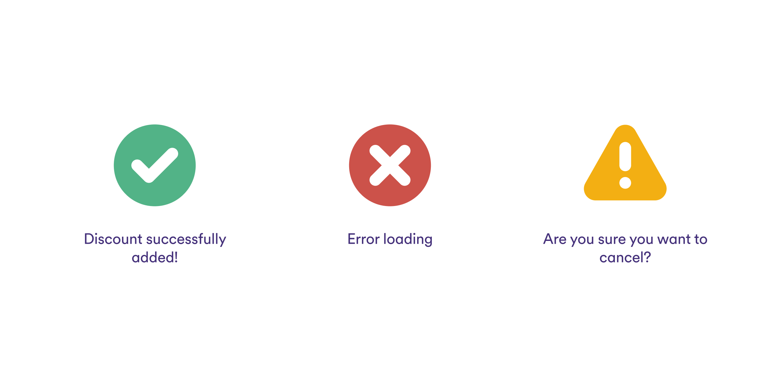
On a visual level, for example, it’s important to confirm if icons, illustrations and images reinforce what is meant in the text, if they apply to all markets and also if the colors we are using help to reinforce the semantics of the message (or not!).

In Cabify’s Design System, for example, we use semantic colors, which have the same basic meaning in any context, to reinforce our messaging. We use red for negative messages, such as error warnings; yellow for attention or caution; and green for positive messages, such as actions performed successfully.
At the verbal level, it is important to ask questions such as:
- Are we already using similar terms to say the same thing?
- Are these terms in our glossary?
- Is it necessary to create a new concept for what we want to communicate?
- Is it an error message, permission message, etc?
- What verbs do we usually use for this action?
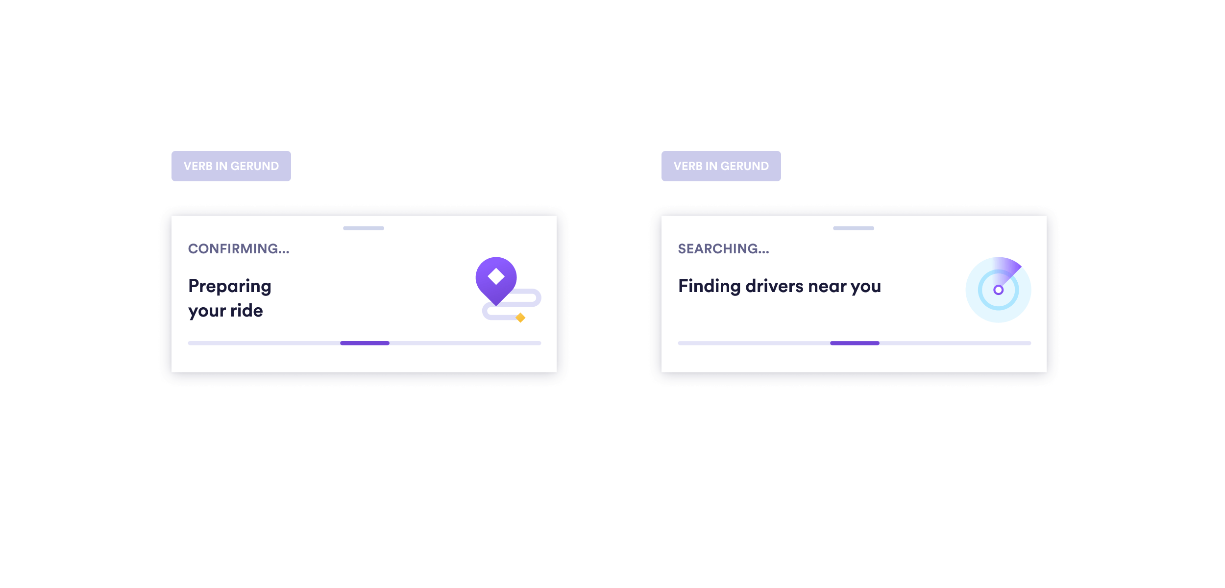
Keeping these questions top of mind helps to ensure verbal consistency throughout the user experience. It ensures that the product always speaks with the same voice and brand personality, regenerating understanding, trust and recognition.
At this stage, to establish consistency, it can be helpful to consult existing UX Writing guides and even the localization platform with all the product copies.
It is also worth mentioning that many of these aspects should already be guided by the Design System and embedded in the DNA of the product, but it’s a good idea to review them.
Information architecture
Another fundamental step in the UX Writer’s workflow is the hierarchy of information. Giving the appropriate weight to each part of the message helps us to be clearer and more understandable.
For example, if what we are writing is the most important information, this should be the title. If we have a lot to tell, we can split up and add a description. If the new copy, in turn, is not the most important aspect, it may work better as a disclaimer.
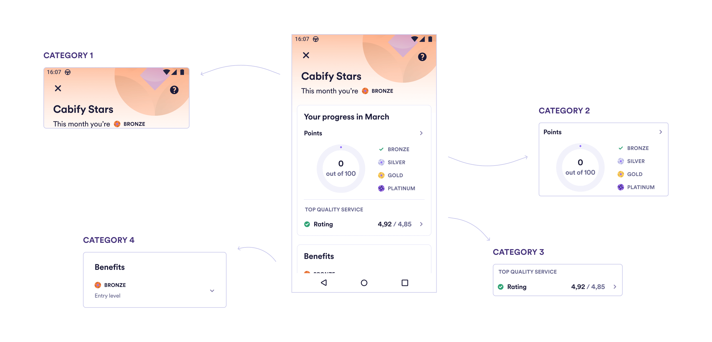
The goal is to present the information in a kind of inverted pyramid, just like in a news story, to make it easier to scan. We start by focusing on what is most important to the user and leave the details for later.
Putting this puzzle together enables us to organize the information into a more readable and understandable format. In addition, prioritizing the text accordingly will help developers to organize and name coherently the keys that will go to the localization platform.
Action and reaction
Analyzing how the new text affects the overall experience is another important part of the UX Writer’s job. Locating the copy in a non-isolated way makes us 1) validate if it is integrating organically and 2) if adjustments need to be applied at other points in the workflow.
If the new copy is just informative, it will be simpler. However, if we are talking about a change that affects other stages of the experience, it will be necessary to edit the associated screens to avoid verbal ‘noise’.
For example:
- If you edit a text in the checkout, check if there are implications for service status notifications in the menu.
- If you change the verb of a CTA, remember to apply the same in the respective confirmation screens.
- If you decide to use a question in the title of a location permission message, check if it makes sense to implement the same in the other permission messages.
In other words, review the before and after of what you are working on so that there are no inconsistencies in the storytelling.
Writing
This is the part we’re best known for. But, of course, it’s far from simple. This happens because we have few words to communicate with the user and we usually need to follow some rules to convey the message efficiently.
Here, we need to anticipate possible doubts and frustrations of users and help them find what they are looking for. And this almost always using fewer characters than a tweet and following the basic rules of microcopy: being clear, direct, concise, decisive and human.
When writing error messages, for example, we need to guide the user explaining how to fix the problem or minimize the chance of it happening again. If we’re talking about permission acceptance copies, we need to take into account the requirements set by the app stores to avoid issues with releases.
It is also the time to consider if pluralization will be needed, to minimize localization efforts later and to validate the text with other stakeholders if necessary.
Localization
When writing the copy, internationalization should be taken into account. This enables us to pinpoint problems that may not be crop up in the source language but may become an issue in translation.
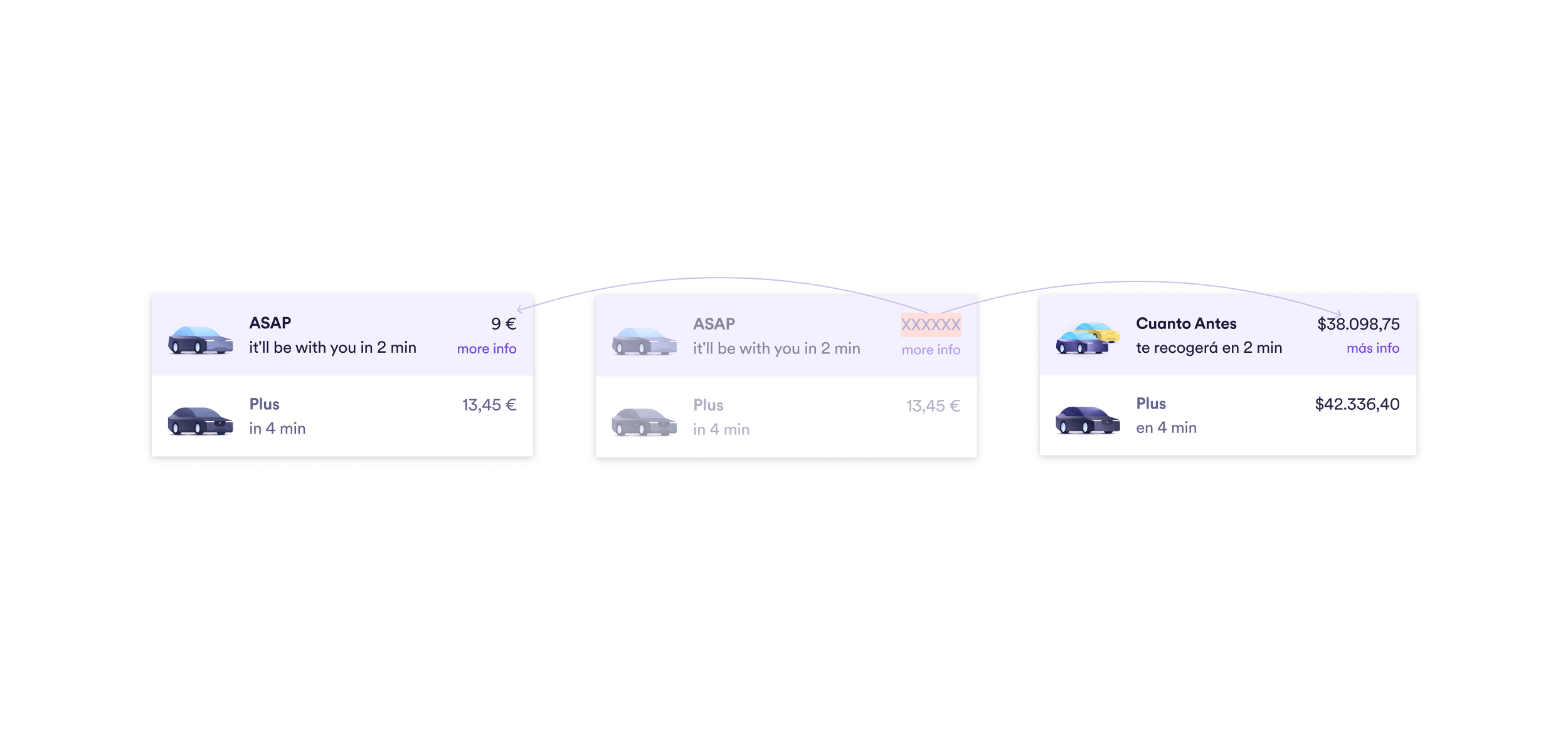
For example, if the copy includes a price, the number of characters for local currencies needs to be considered so that they fit the design after localization.
 It is also crucial that the keys in the localization platform are grouped according to their section or functionality, so that translators can easily relate them. Generally, naming them is up to the developers, but the UX Writer can establish naming guidelines in order to inform them of the hierarchy and purpose of each key.
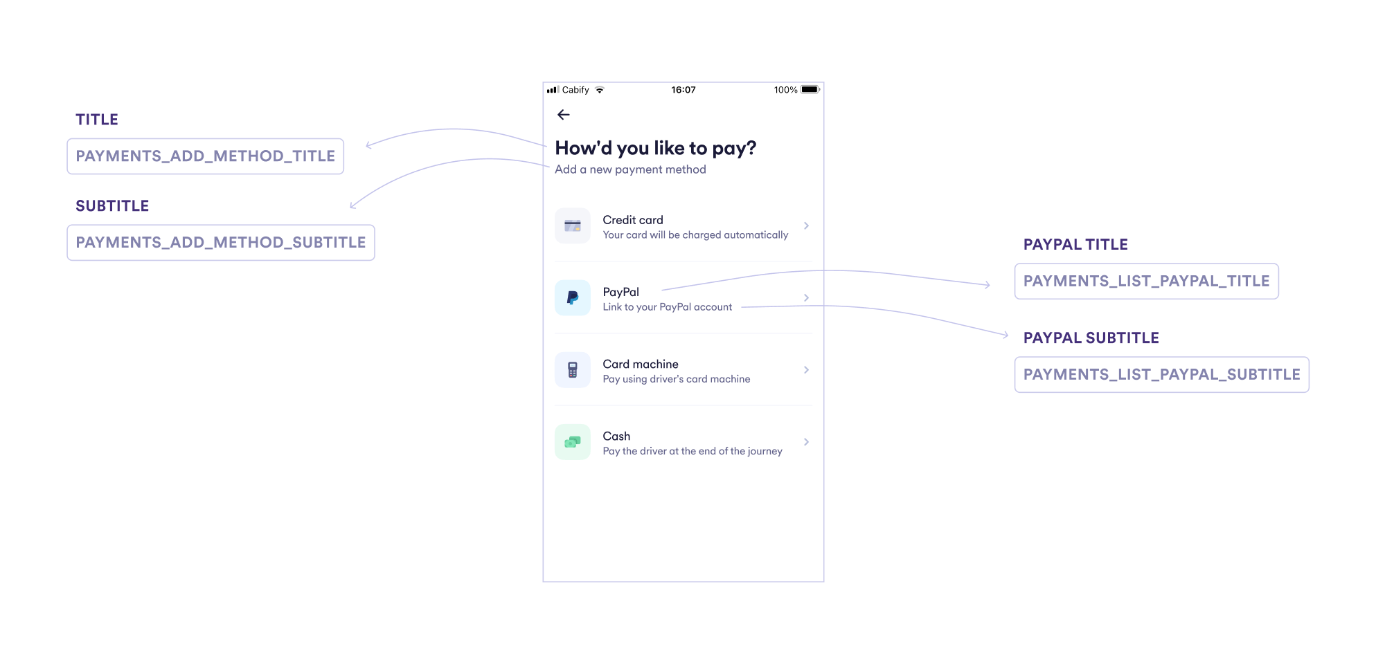
Translators will then have a better idea of exactly what it is they are localizing. For example, if the copy is a title, if it’s part of the menu, if it forms part of the onboarding flow, or if it is an error message.
With practice, we find that these steps come naturally. This makes us more efficient and help us to produce higher quality copies.
On the other hand, giving visibility to what is behind each word makes us even more effective teams when working for the best user experience.
…
This post was written with the help of Cabify’s Content and Design teams. <3

We are hiring!
Join our team and help us transform our cities with sustainable mobility.
Check out the open positions we have in .